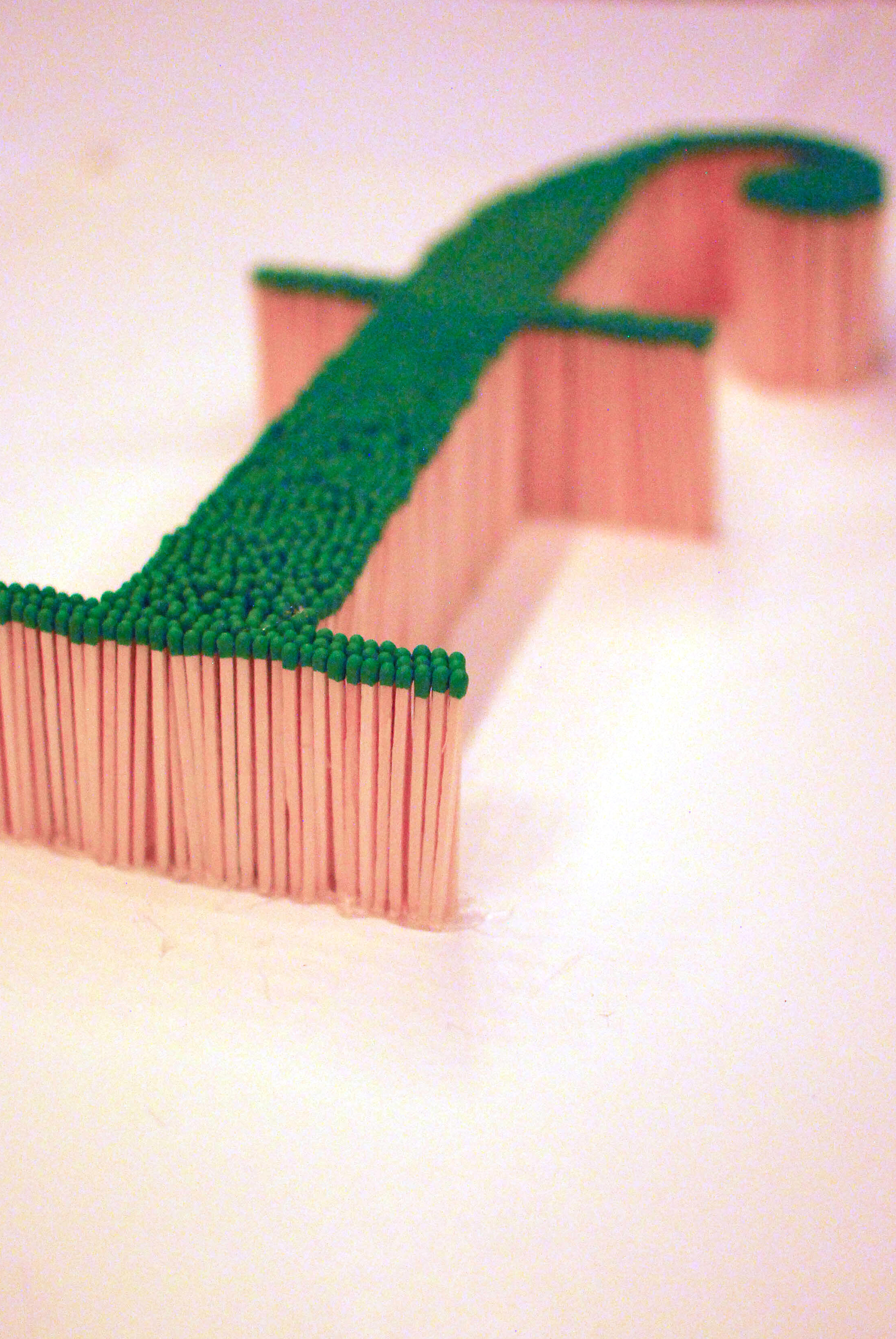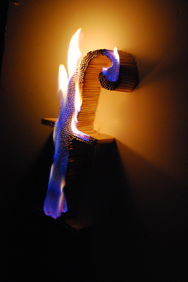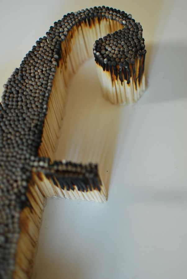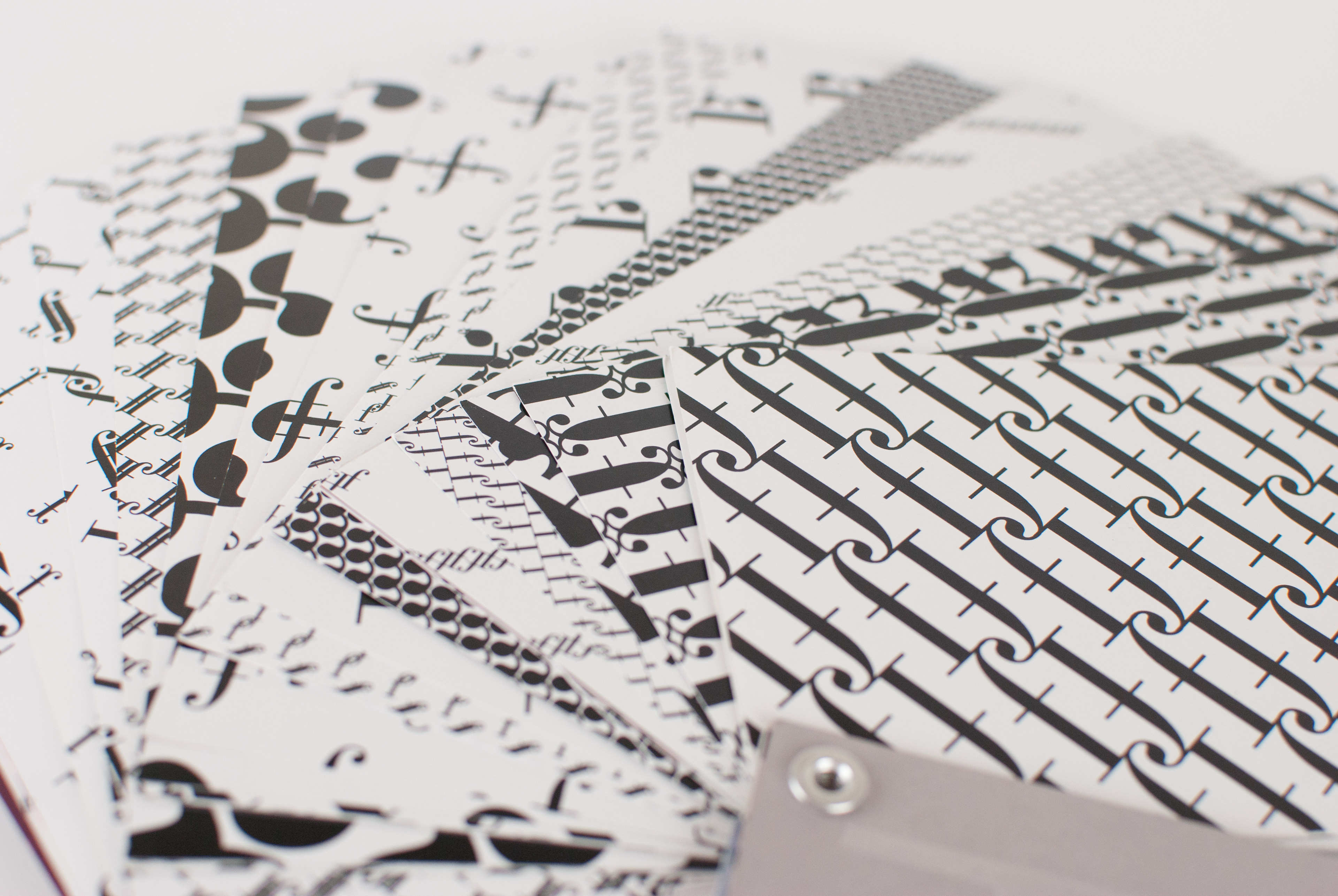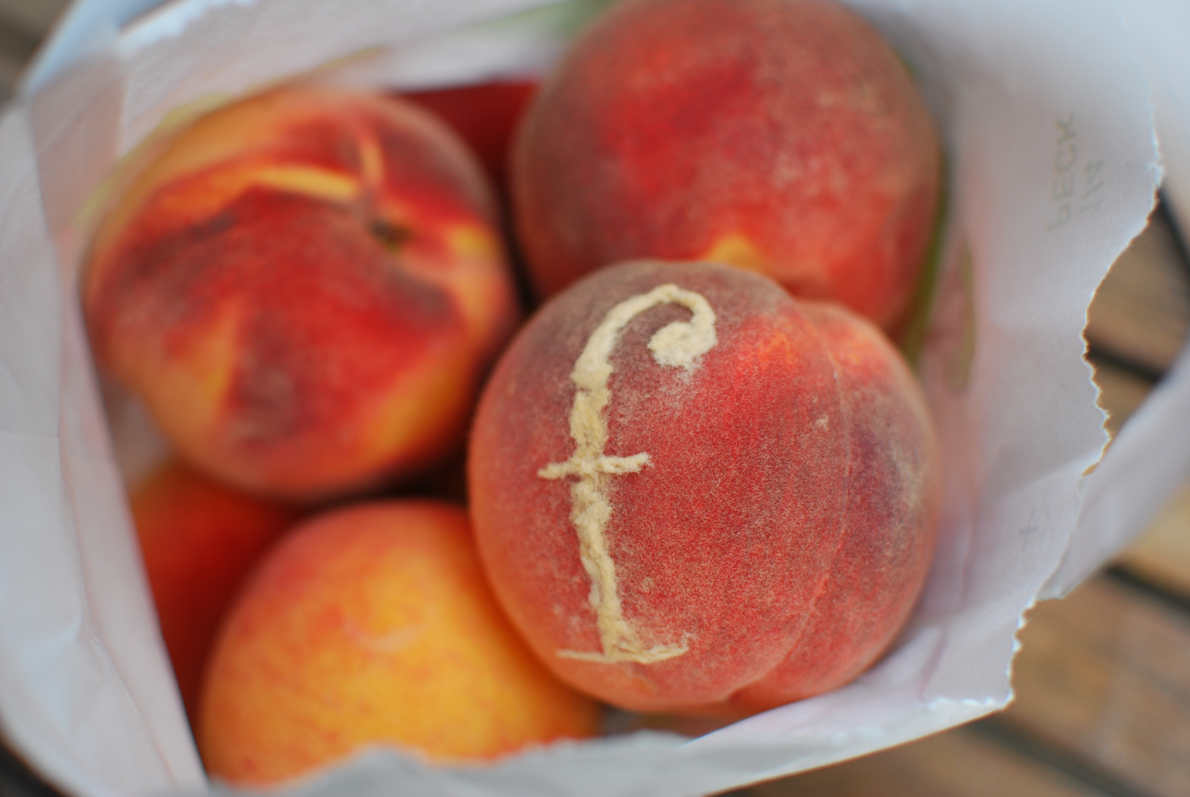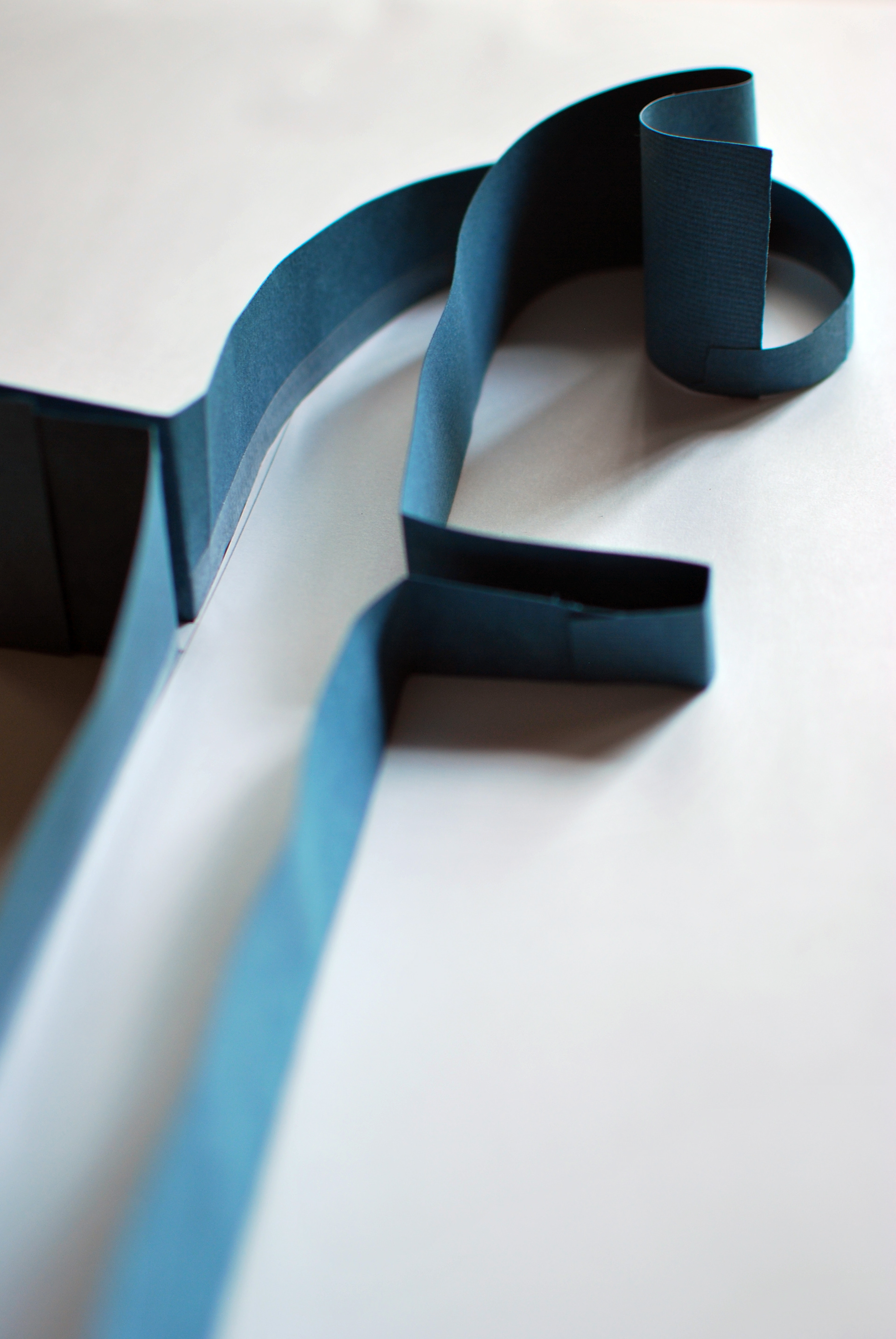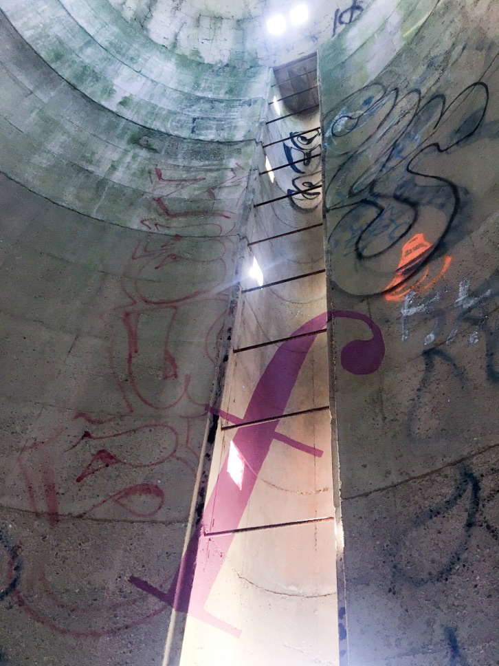
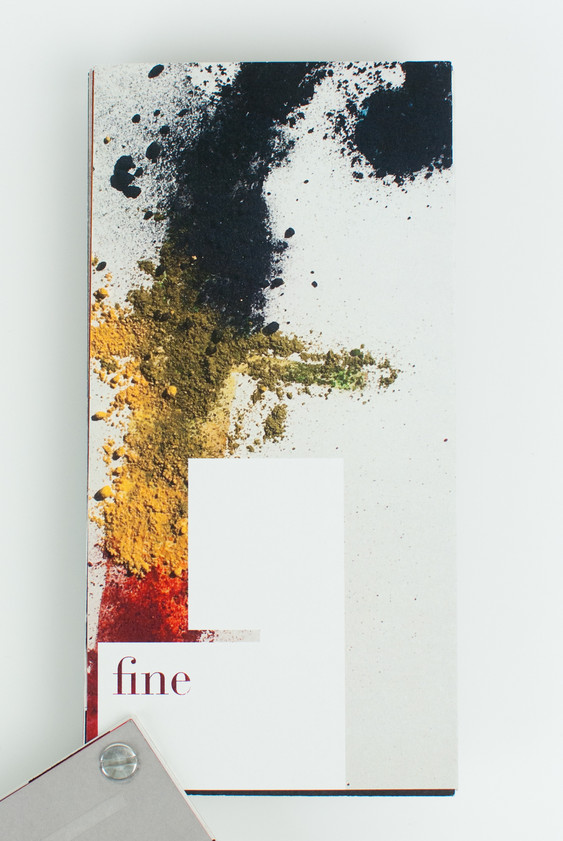
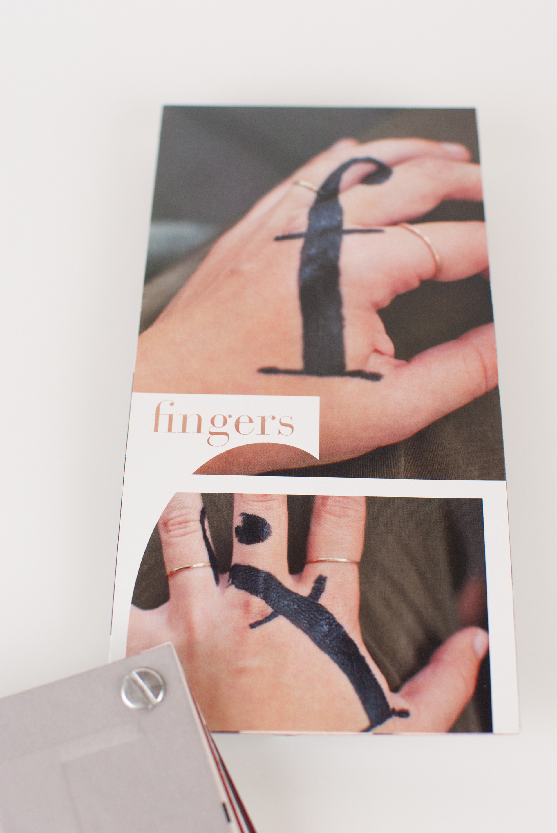
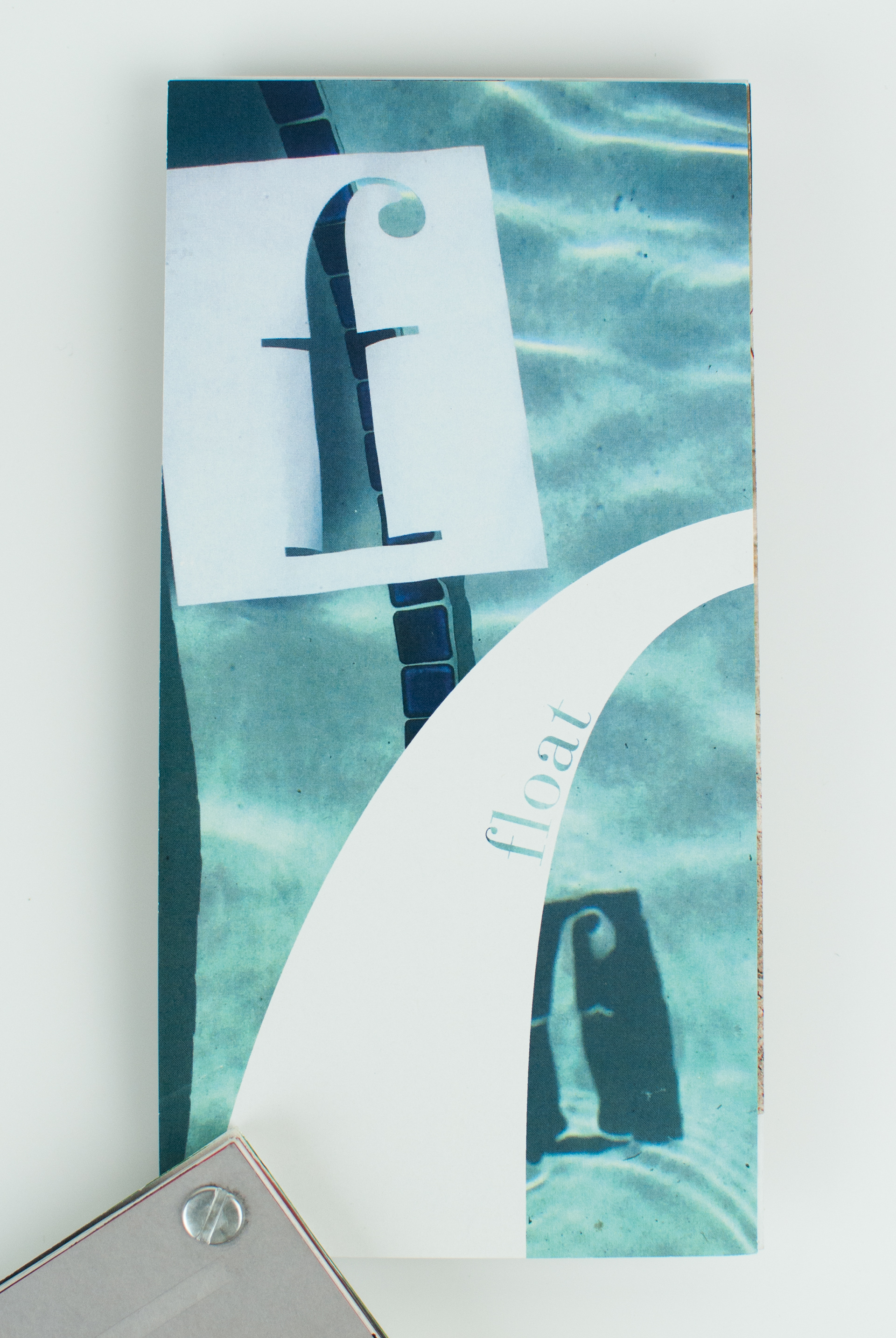

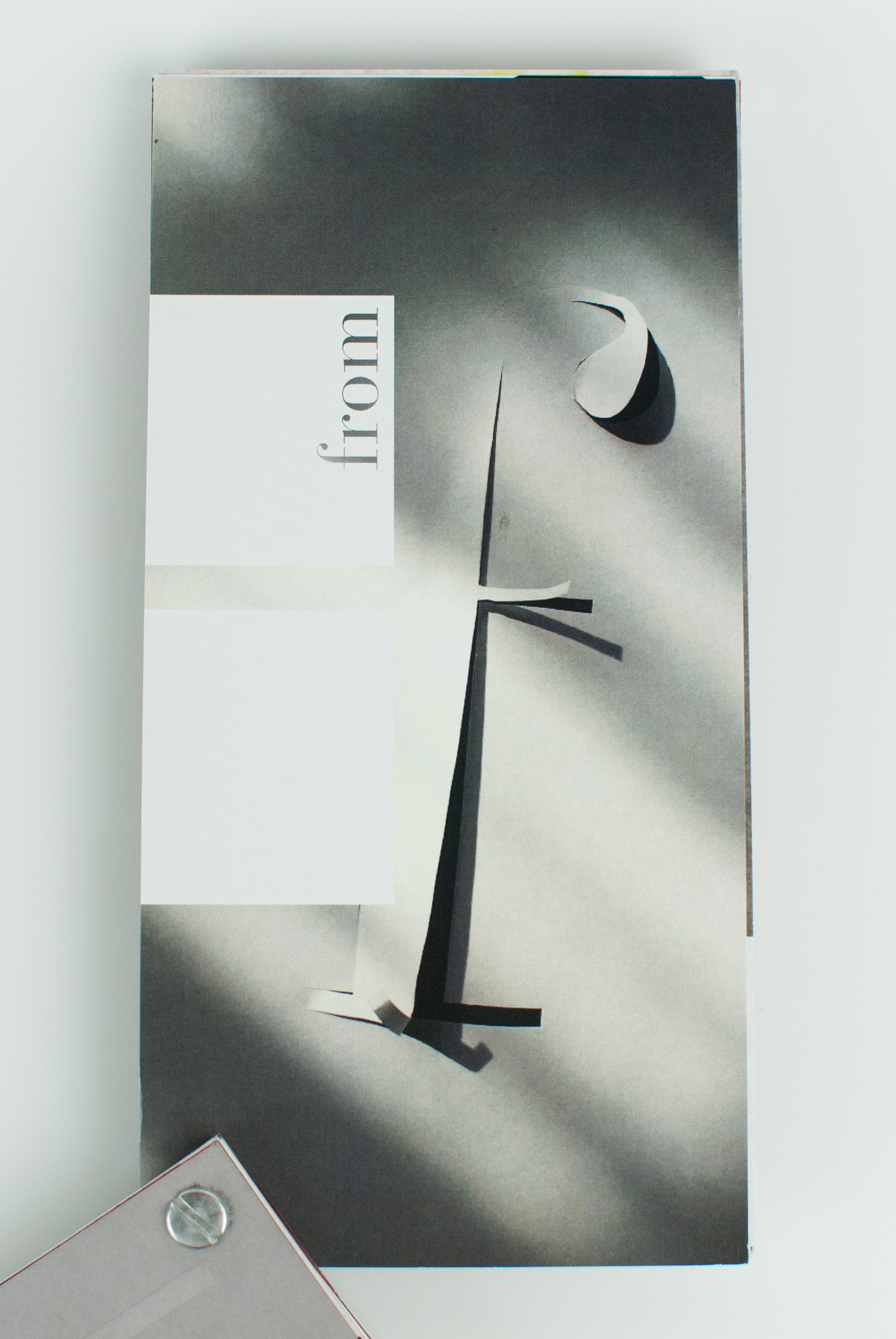
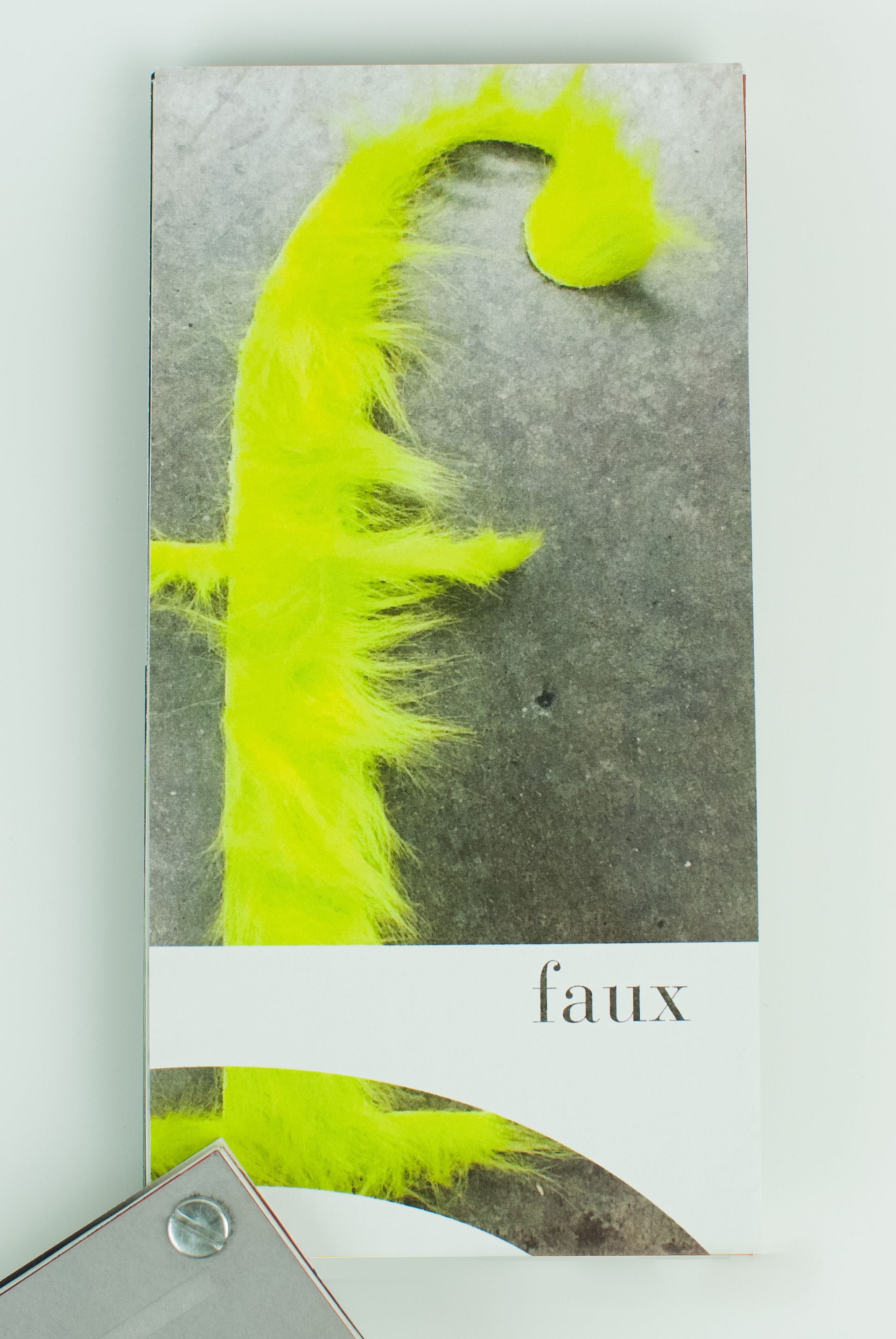
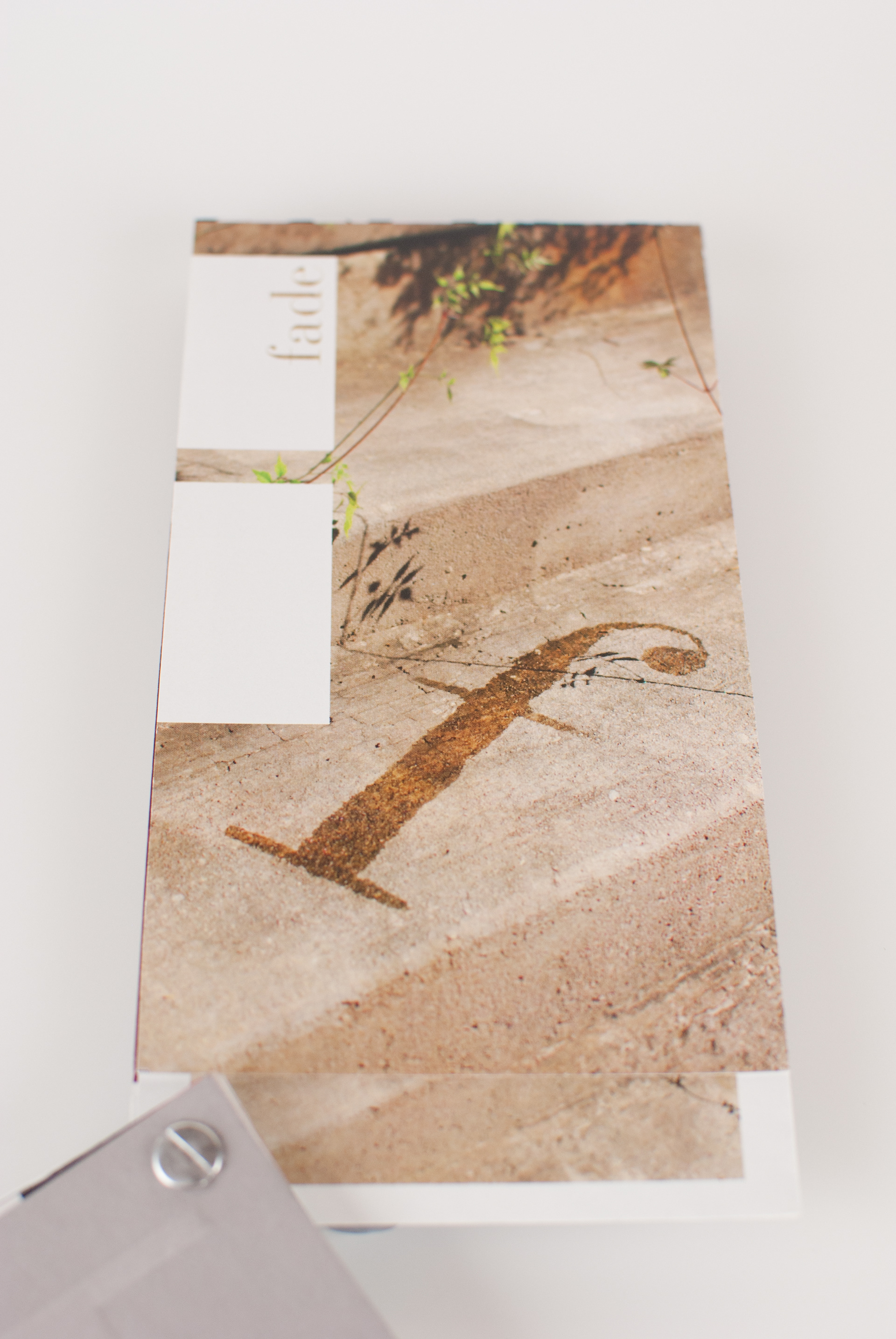
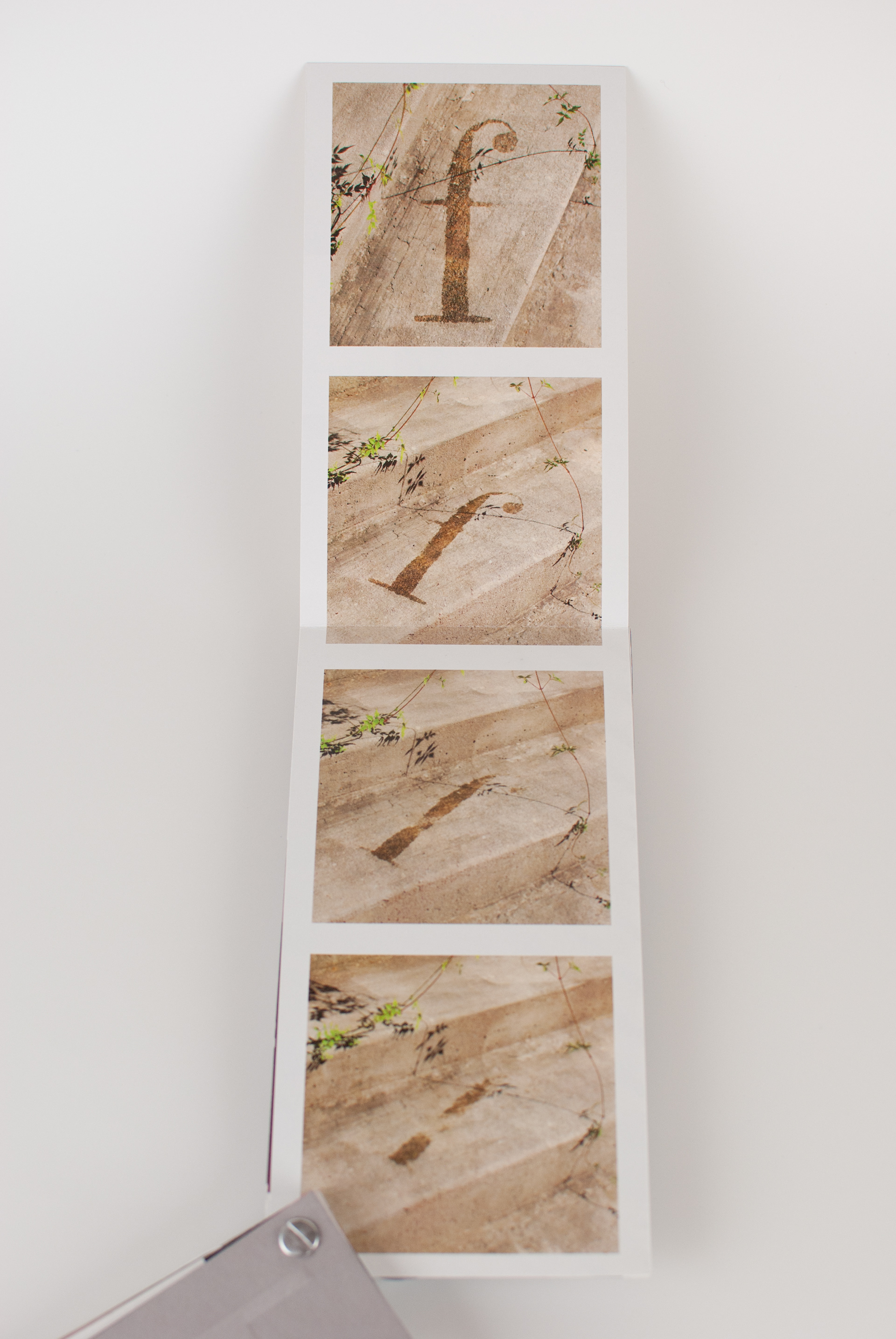
This editorial project explores the physical form of the letterform "f" from the Bauer Bodoni typeface.Through crafting this letterform out of a variety of materials, I discovered ways to emphasize the contrasting thicks and thins, as well as the straight lines with the curve of the ball terminal. The creation process allowed one version to lead to the next with the final composition; fade (shown above) truly demonstrating the key attributes of this form. The exploration resulted in a 32 page screw post bound book with several fold out pages. Each page contains one version of the letterform with a title contained in a cropped portion of the "f" letterform. The back of each page is a full bleed unique pattern crafted solely from the letterform. Working with typography in this way reveals the beauty and character of each letter, and the variety of moods that can be derived from just one.
